While researching fiber-reactive dyes recently, I stumbled upon a technique called ice dyeing. It’s similar to tie-dye but a little more unpredictable. You sprinkle powdered dye over ice placed on the fabric, and as the ice melts, it creates beautiful, watercolor-like blends that feel soft and organic.
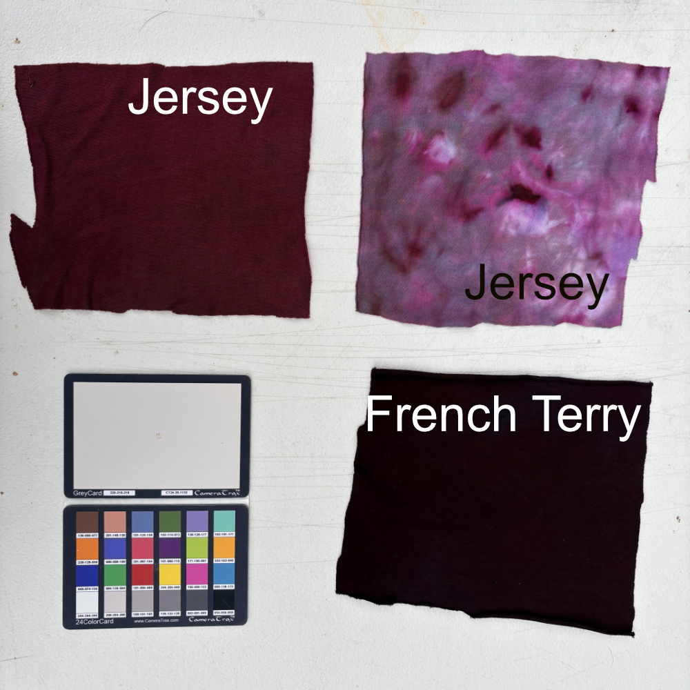
I ordered a few supplies from Dharma Trading Company and picked up a couple of dyes from my local craft-thrift store to give it a try. Before dyeing any yardage or finished clothing, I wanted to make swatches of the colors I had for reference, using two types of ready-to-dye (RTD) knit fabrics: Modal Rayon Jersey and Bamboo/Organic Cotton/Spandex Baby French Terry. For each color, I made an ice dye swatch on the jersey and a tub-dye (low-immersion) version on both fabrics for comparison.
Dye Methods
I soaked all the swatches in a water-and-soda-ash mix before dyeing. I left all the swatches in both dyeing methods for 24 hours.
Solid Dye – While still useful as a reference, I thought the ziplock bags would simulate a tub dyeing process, but it was probably more of a low-immersion method. The two fabrics per bag didn’t have much room to move around, which resulted in a mottled look.
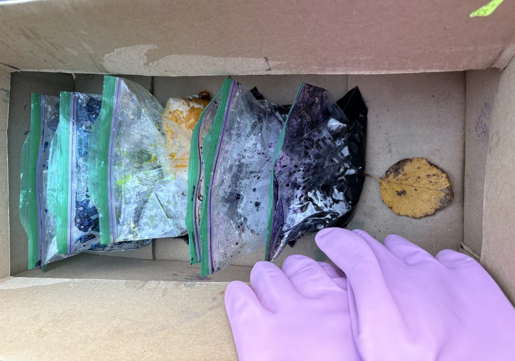
Ice Dye – For this method, I scrunched the fabric and placed it in a plastic cup with holes poked in the bottom. I used a dye over ice method (DOE). The cups drained into a catch basin, causing the swatches to sit in the muck while the dyes reacted.

Color Swatches
With the low-immersion swatches, I was surprised by how differently some of the dyes appeared on the jersey compared to the baby terry. With the ice dyes, I wonder if the limited space at the bottom of the cup, or the fact that the dye cups sat in the muck, contributed to the lack of negative space in some swatches.
I labeled each piece with an industrial Sharpie before dyeing, but some markings disappeared during the process, so I’m only mostly sure I labeled correctly after the fact. To help my iPhone capture the colors as accurately as possible, I used a white balance calibration card in every shot. That should help keep colors consistent when I photograph future swatches, too.
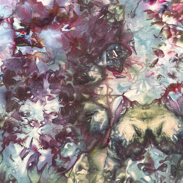
Eggplant (Dharma Fiber Reactive Procion 115)
I think this one has a lot of potential. I wish I’d captured more negative space in the ice dye sample, but I love the raspberry tones it splits into.
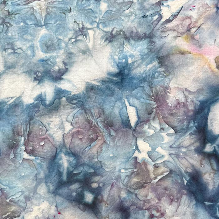
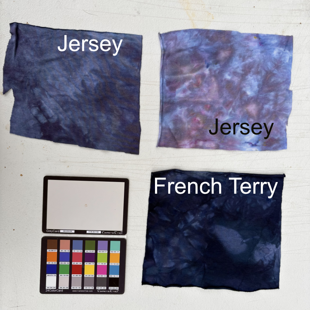
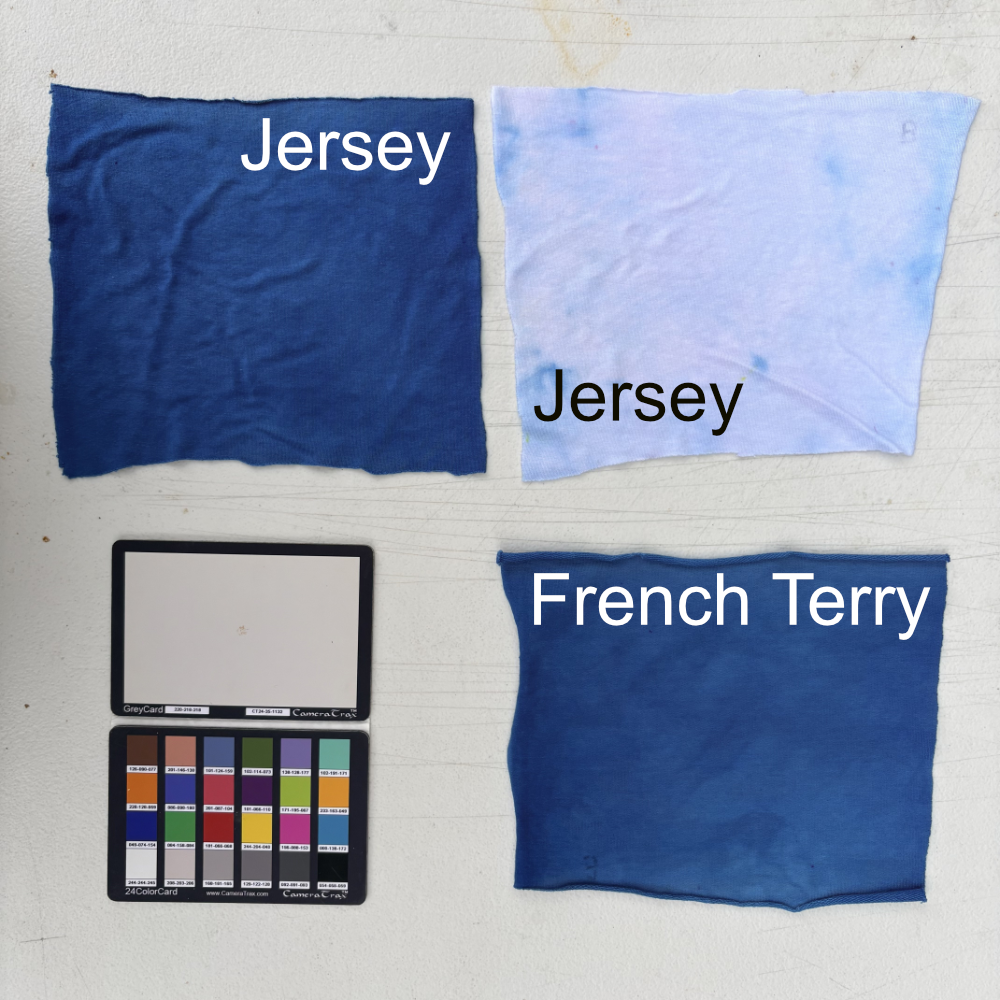
Wedgewood Blue (Dharma Fiber Reactive Procion 76)
The colors in this are so pretty, featuring blue and deep purple with hints of yellow. I especially love how the low-immersion jersey sample has that textured purple-grey-indigo tone.
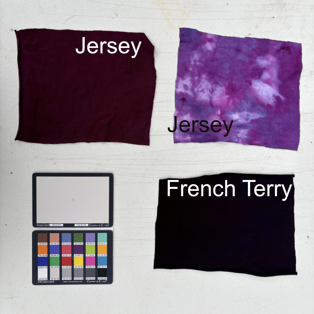
Power Berry (Dharma Fiber Reactive Procion 161)
This came out pretty close to the preview, and I love how it includes a range of purples, some warm and some cool.
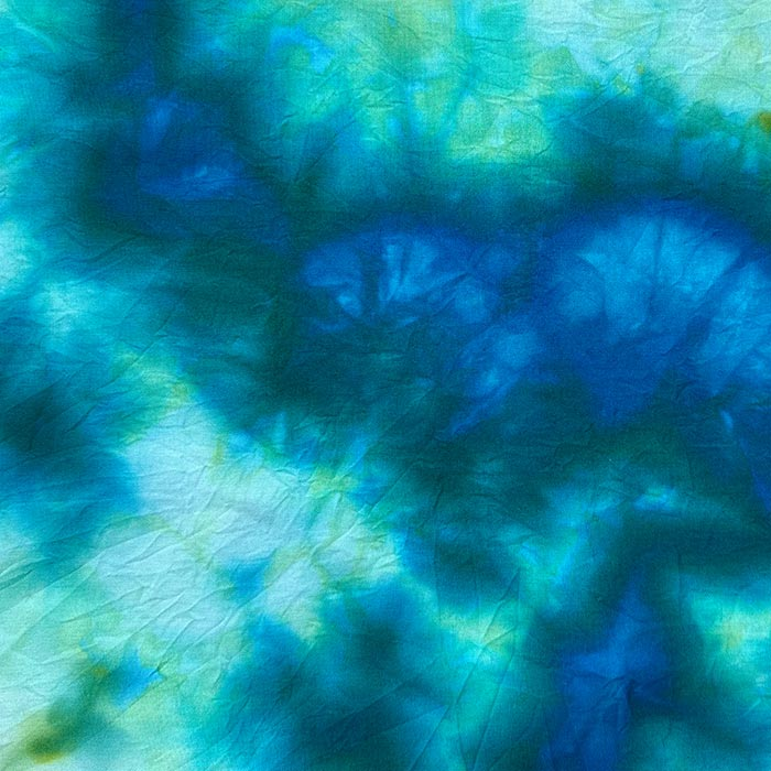
Mermaid’s Dream (Dharma Fiber Reactive Procion 153)
This swatch feels so bland compared to the preview on the Dharma site. I suspect it’s because I forgot to add Glauber’s salt. I plan to re-swatch this color in both ice and solid dye tests.
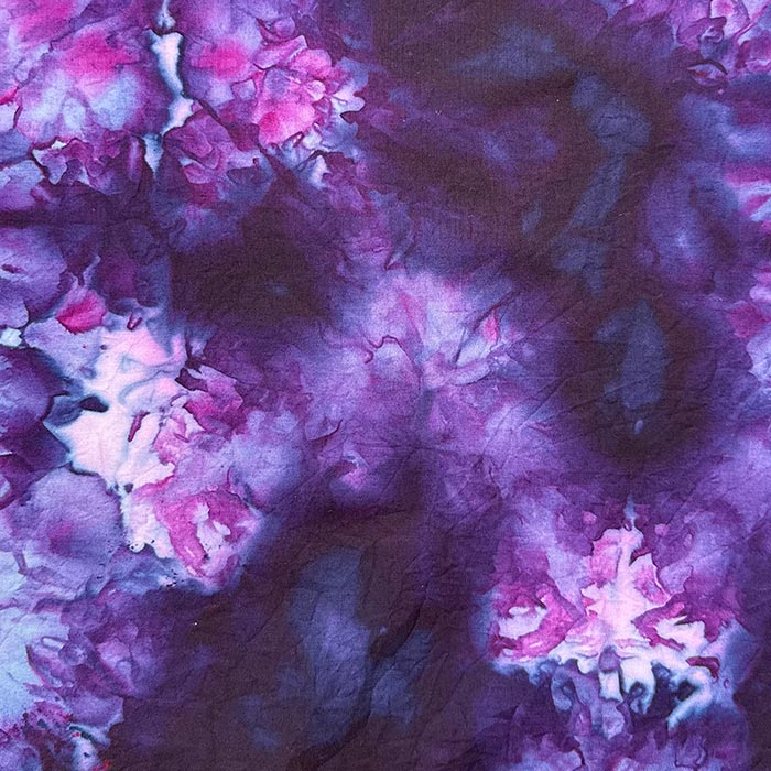
Hydrangea (Dharma Fiber Reactive Procion 159)
The splits on this one are beautiful, pinks, purples, and a hint of indigo. I think it would’ve turned out even better if it hadn’t sat in the muck.


Bright Blue (G &K Craft 404)
I picked this one up secondhand from the craft thrift, and the ice dye result is pretty bland. I might re-swatch it later. The lackluster results might be beginner’s errors on my part.
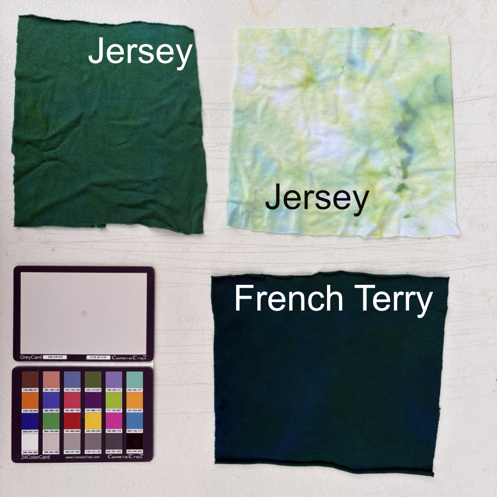
Sun Yellow (G&K Craft 108)
This will be a great supporting color in blends. The swatch confirmed that it’s a single-tone dye, which should make it a nice mixer, only introducing one color.
Ice dyeing feels a bit like alchemy. The way a single solid color, when mixed with water, reveals specks of pigment that melt and spread across the ice to create something completely unexpected. I can’t wait to keep experimenting with these color blends on some larger-scale pieces next.
1 comment
Comments are closed.